CONTENT
Another scale of architecture
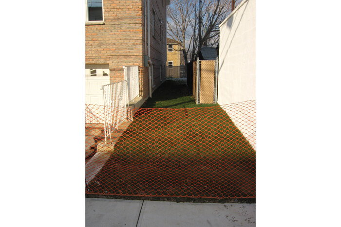
In 1973 Gordon Matta Clark found out that the city of New York intended to sell a series of small plots by auction – land left over after the abstract geometry of the grid encountered the reality of topography, the logic of a will or just itself in the form of another grid, tight stretches of spaces between houses sometimes no more than a meter wide, but up to 100 meters long, plots inside other buildings, small patches of lawn, asphalt or cobbles, slivers of kerbsides and passages, spaces between a fence and a sidewalk, oddities left over after everything had been divided. The perversion of an abstract system: everything can be sold and possessed, even if it cannot be used inside the logic of the system itself.
 ©
©
Matta Clark bought 15 plots with different dimensions and geometries scattered throughout the two boroughs of Queens and Staten Island. He documented his new possession through deeds, maps and photographs. For Matta Clark these small pieces of New York were real parts of New York, not estates but spaces, spaces between brick walls, where trees grew and birds sung, where life took place every day, even if they were useless according to the logic of property speculation. In the end he possessed more than 300 square metres of New York, the equivalent of an artist's loft spread out on the city: a continuous reality of discontinuous spaces connected by the fact that they were produced by the same phenomena and were consequently all part of the same family, a discontinuous property in the scale of Queens.
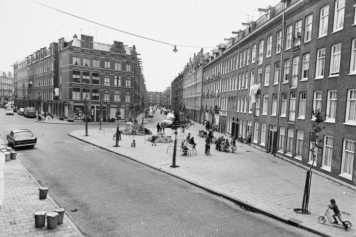
In Amsterdam where Marathonweg crosses Bertelmanstraat the houses retreat on two opposing sides of the street and create an open space of approximately 45 by 90 metres separated in two equal parts by the Marathonweg itself. On the north-west half of Bertelmanplein the young Aldo van Eyck designed his first playground in 1947.
The curb along Marathonweg folds inside and accompanies the houses of Bertelmanplain, folds in the corner again before following along Bertelmanstraat. At the distance of a secondary road another curb accompanies the first, offset by a few metres. Later it follows along Bertelmanstraat and Marathonweg before reconnecting to itself and producing a sort of rectangular island. On the south-western side of this place the sidewalk of Marathonweg with its concrete pavement continues on the island while all the rest of the space is covered with a brick pavement. Away from the street in the central part of the space a wide concrete rim surrounds an ample rectangular sandpit. The rim has two lower parts placed towards the interior road which facilitate entrance, while on the rest of the rim someone can sit down or use it as a plateau where to put toys and other things. Along the outside of the playground trees grow providing shadow and several benches are placed where someone can sit. Apart from the sandpit there are a number of simple frames made out of metal tubes, a ladder and a series of brackets fixed to the ground inside the space of the plateau.
The curb along Marathonweg folds inside and accompanies the houses of Bertelmanplain, folds in the corner again before following along Bertelmanstraat. At the distance of a secondary road another curb accompanies the first, offset by a few metres. Later it follows along Bertelmanstraat and Marathonweg before reconnecting to itself and producing a sort of rectangular island. On the south-western side of this place the sidewalk of Marathonweg with its concrete pavement continues on the island while all the rest of the space is covered with a brick pavement. Away from the street in the central part of the space a wide concrete rim surrounds an ample rectangular sandpit. The rim has two lower parts placed towards the interior road which facilitate entrance, while on the rest of the rim someone can sit down or use it as a plateau where to put toys and other things. Along the outside of the playground trees grow providing shadow and several benches are placed where someone can sit. Apart from the sandpit there are a number of simple frames made out of metal tubes, a ladder and a series of brackets fixed to the ground inside the space of the plateau.
 ©
©
Until 1978 van Eyck had designed more than 700 of these playgrounds inside the city of Amsterdam. They were placed between fire division walls, on public ground, between two streets, along a channel. The first playgrounds had been a way to get back to normality, a temporary measure. Voids created by bombs were cleared, a hard pavement laid down and a series of simple elements placed. Beyond that sand, wind and sun were all that was needed. Later they became an essential urban infrastructure, and some of them still exist today. The elements someone encounters on the playground can be found in different form almost everywhere throughout the city. The games played here can be continued elsewhere. But even if the system of the playgrounds is widespread and the elements are repeated, their precise form and placement is always site-specific. The design of the grounds renders them a place inside the continuous space of Amsterdam, a composition of frames, different pavements and geometric elements suggesting each one different uses. There are no limits, no fences dividing the playground from the surrounding urban space. They provide free movement on them and free access to them for everyone. They are just a different intensity of play inside a wider playground. It is through repetition and widespread dissemination that they are able to qualify the whole city through the continuity of a discontinuous system.
Continuous architecture
After the Gruber Canal had been constructed at the end of the 18th century in order to bypass the urban area of Ljubljana and the river embankments inside the city had been build at the beginning of the 20th century, the relation between the City of Ljubljana and its river changed completely. The water now flew on lower level and the river was disconnected from the houses of the city.
Finally, during the 1930s, Joze Plecnik was commissioned with the design of the riverbed and embankments of the Ljubljana. His first intervention consisted of the renovation of the embankment of the Gradascica River, which is a small feeder of the Ljubljana. Today this river flows inside a small depression several meters under the level of the surrounding city. Plecnik designed the embankment so that it could serve as a paved sunken alleyway with a runnel in the middle. On both sides the slopes were covered with lawn. Willows as well as other trees were planted on them. When walking inside this space the effect which is created by the profile of the embankment is of walking inside a park, with only the sky above, lawn, trees, water and occasionally a bridge build in stone where to cross under.
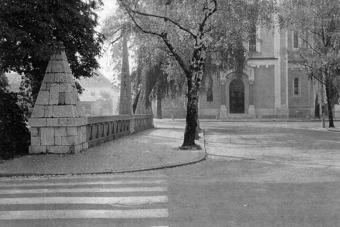
While working on the Gradascica, Plecnik also designed a 17 metres wide square for a church, which had been placed adjacent to the river. The square has birches planted on both sides. The Gradascica crosses it underground and the place serves as a bridge connecting both banks. It is the scale and dimension of the space, which qualifies it as a square, but it is also a question of how the church and the other elements are placed and related.
Where the Ljubljana turns around the old city with its fortress on the hill, Plecnik added two footbridges to an already existing bridge to connect the different spaces on both sides of the river: a street and the passages along the river on the side of the old city with a wide square from which multiple streets depart on the opposing side of the river. The footbridges are placed at a distance from the existing bridge on either side of it in such a way as to connect the narrower space of the street with the wider space of the square. They do not only connect both sides of the river but they also lead to the passages, which are placed at a lower level inside the walls of the embankment. All three bridges are fitted with the same uniform balustrade. The ensemble creates a large space which connects both riverbanks and is pierced by triangular holes confined by balustrades. Poplars seem to be suspended inside them growing at a lower level with water flowing under it – a masterpiece of architectural composition.
At the same time Plecnik renovated the old Cobblers’ Bridge situated between the complex of the three bridges and the spot where the Gradascica flows into the Ljubljana. Here he substituted the old bridge with a 12 metres wide plateau which is placed across the river. Balustrades complement the bridge with columns on them as well as two electric light poles designed by him and placed in the middle along each side. The plateau is positioned in relation to a small square between two houses on the left bank of the river extending this space above the waters of the Ljubljana. Here markets can be held, people can meet and exhibitions and celebrations take place. Behind a small street in the old city the castle hill rises.
Combining his interventions along the Ljubljana, Plecnik designed an architecture as large as the city, capable of mediating between different scales. In his design the scale of the river encounters the scale of the city, water encounters stone, stone encounters vegetation and everything is reflected in the continuous modulation of a surface of water. It takes very little to achieve a miracle, carefully placed bridges with the size of a square, well chosen and placed trees or the sapient modulation of an architectural element in section: a wall.
Along Trnovo Quay this wall becomes an extended stone clad terrace accompanied by a walking path on its upper ridge and protected by a continuous line of weeping willows. This is a perfect place were to take a bath or sit in the autumn sun. In another setting, above the ensemble of the three bridges, the wall is extended beyond the level of the balustrade and becomes a long colonnade. This colonnade starts right beside the three bridges, where a flower kiosk has been placed inside, continues along the river until the colonnade suddenly embraces an urban void becoming the outer edge of an existing open space. Here it becomes part of a different kind of architecture consisting in the facades of the houses of the old city, a square and the wall itself. A well-designed wall is all it takes; it rises and defines a larger urban space creating the open central market of Ljubljana.
Two different species of spaces: one based on a widespread dissemination such as in the case of Matta Clark or van Eyck and one defined by a continuous architecture such as in the case of Plecnik. The continuity of a discontinuous system and the discontinuity of a continuous element: two examples of the variety and potential of architecture in relation to the city and other environmental patterns.
Sants !
After the construction of the central station Barcelona Sants had been completed in 1979, what remained was a large urban void right at the end of Avinguada de Roma. The station had been built underground on multiple levels with a low rectangular building as entrance covering the central part of the void with parking on top of it as well as a high rise block across it. To both sides of the station there was nothing and nothing could be built or planted on top of the rail tracks running underground, resulting in an urban void which was out of scale and too large to contemplate.
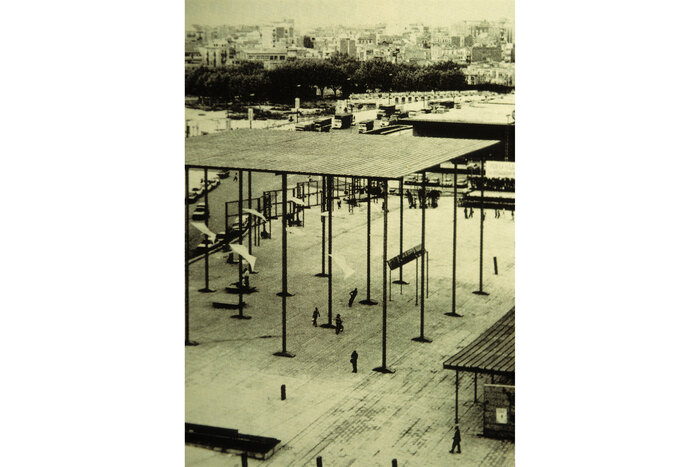
When confronted with the task to design the square in front of the central station Albert Viaplana and Helio Piñon had to master a challenging task. A void in the scale of the city, a desolated place, during summer under a merciless sun, had to be rendered tolerable. How could this be done? By covering it with water? First everything was connected by a large horizontal hard surface, but this was not enough and the surrounding streets still got lost. Then the horizontal plane of a sunroof was suspended high above the ground by slender pillars, which stand on the ground on horizontal foot-like beams. A miraculous event had taken place, as if a table had grown suddenly so large as to become a building, made out of a thin metal structure and a lot of air, casting a large rectangular shadow on the square where to rest during hot summer days. In addition to this horizontal screen a long passage covered with an undulating roof was placed on a lower level across the emptiness of the space, connecting Avinguada de Roma and Carrer de Tarragona with the central station. Now someone could cross Plaza de Sants even under the hottest sun or practice skateboarding in the shadow. The two elements of the suspended horizontal roofs in itself are sufficient to establish a scale for the space. But water was not forgotten at last. In some areas of the square water leaks out of the ground, flows above the hard soil finding its own geometry, before the sun manages to evaporate it and the dry and hard surface of Plaza de Sants is what is left.
There is a different scale to architecture beyond that of the individual building. Whereas a building is conceived as a whole and has to be effective where it is, there are different kinds of settings: interventions, which are disseminated in a widespread manner or continuous elements of which no end is identifiable. Be it through the infrastructural dimension of architecture or the architectural device, it takes architecture, if handled properly, very little to improve the quality of a site or even an entire city: Sants by giving scale and creating spaces through almost nothing is a real lecture of architectural design.
Sometimes a single space is enough to impact a whole city just like in the case of Campo de’ Fiori in Rome. Sometimes this space can be even very small such as in the case of the Paley Park in New York, sometimes the genius intervention of an infrastructural space such as the BRT in Curitiba or the Cable Car in La Paz is able to profoundly change the future of a city at a very low price, sometimes the architectural device of a canopy or the programme of a street market or a shop open 24 hours a day is everything that is needed. A city is a question of design and in a city everything can be designed: a well made connection, an ingenious use, a well used material, a beneficial change or a well devised urban design is quite often all it takes.
Stephan Jung
KEYWORDS
AVAILABLE
SAFT 09 WIDESPREAD
is also available as part of:
Buy it now !
